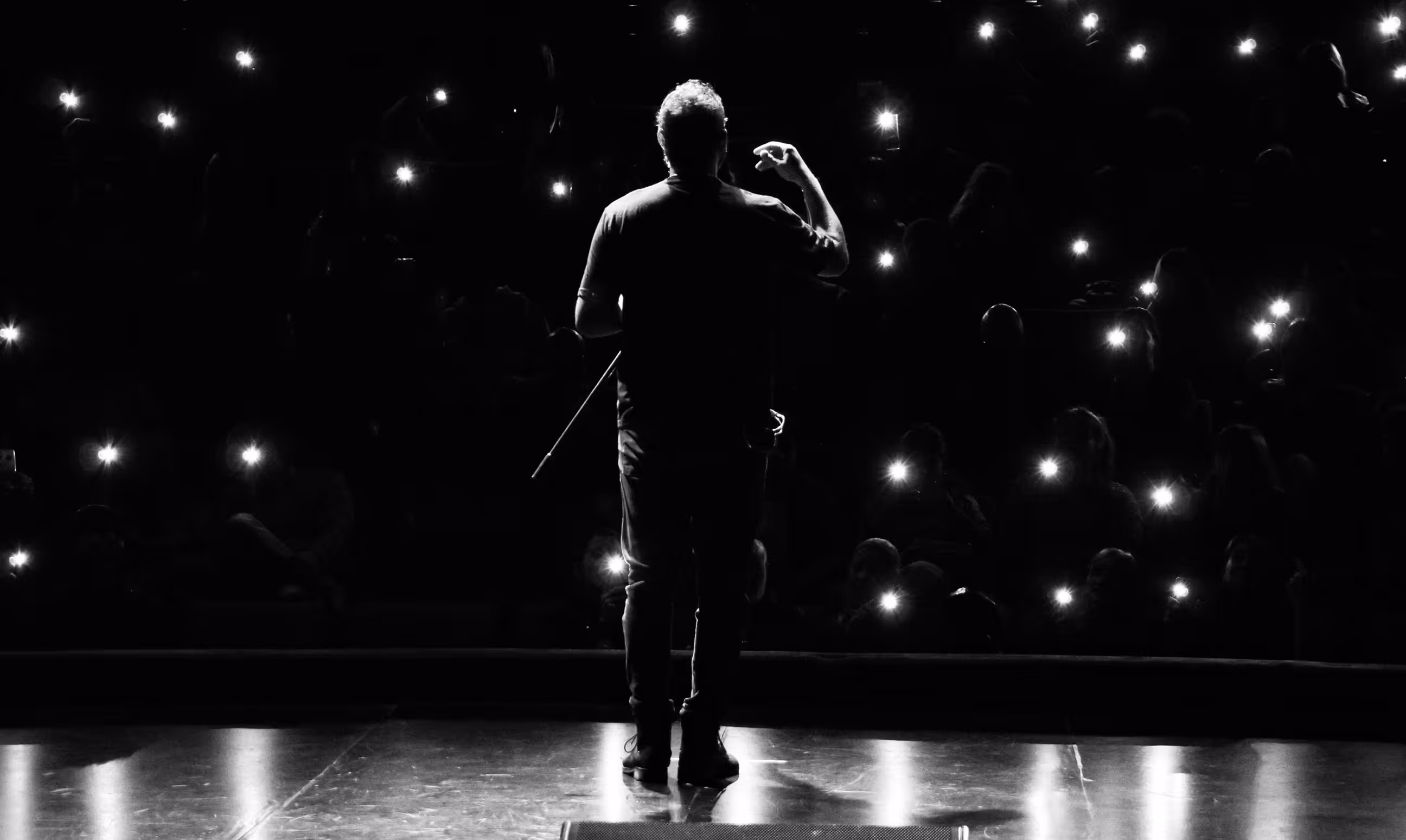


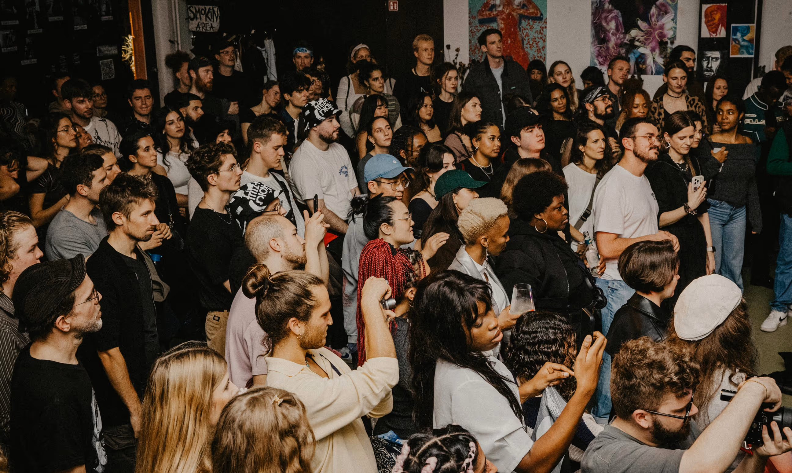


Challenge
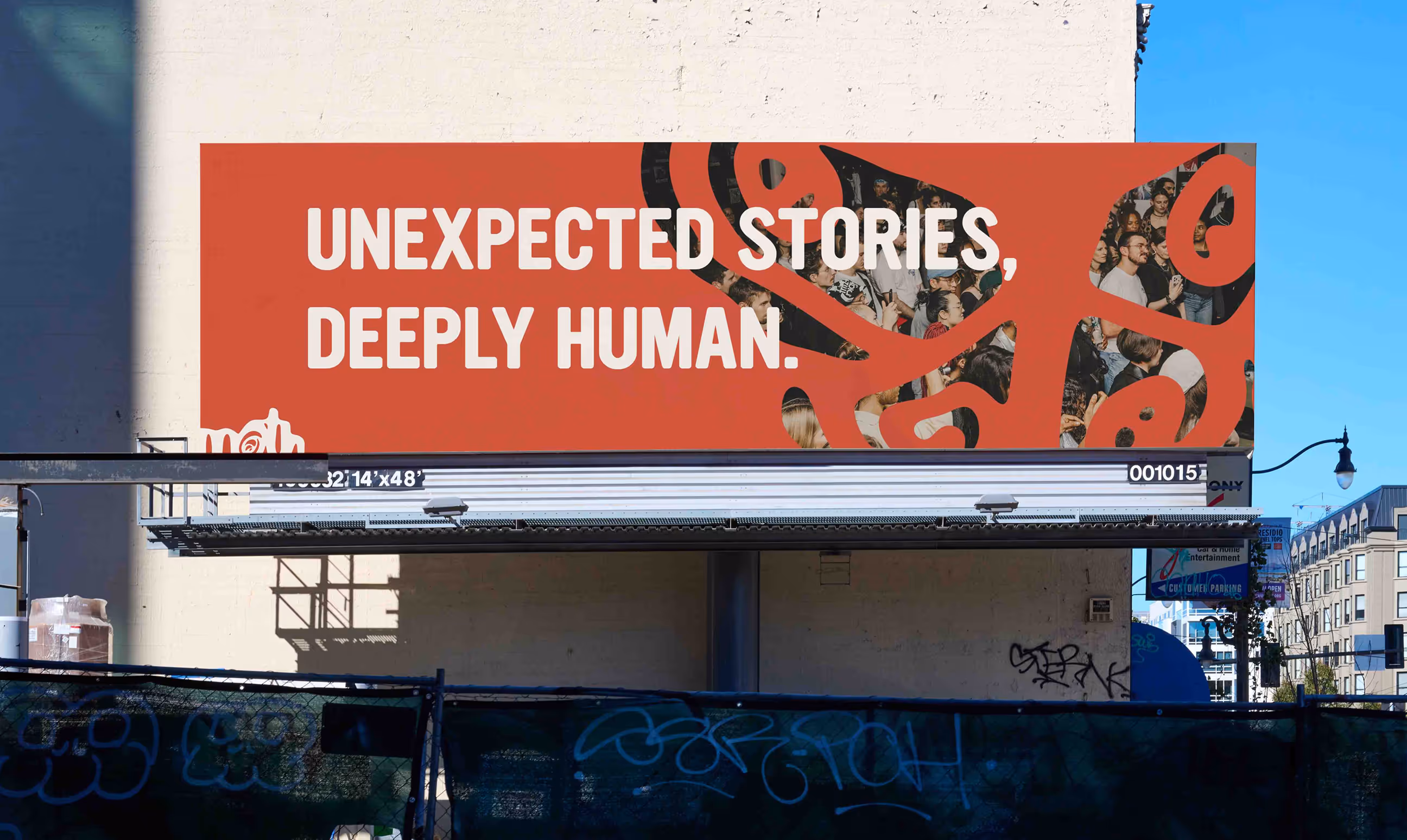
The challenge of this rebrand was to create a more cohesive identity across all areas of The Moth while preserving the honesty and emotional depth that define the organization. Although The Moth already had a strong presence through its live shows, podcast, books, workshops, and digital platforms, the overall brand experience often felt visually disconnected from one touchpoint to another.The goal was to build a unified system that could bring everything together under one recognizable voice and identity while still allowing space for the wide range of stories and emotions The Moth represents. The rebrand also aimed to shift the audience slightly younger, creating a tone and visual language that felt more approachable, playful, and culturally relevant to a Gen Z audience without losing the intimacy and authenticity at the core of the brand.
Solution
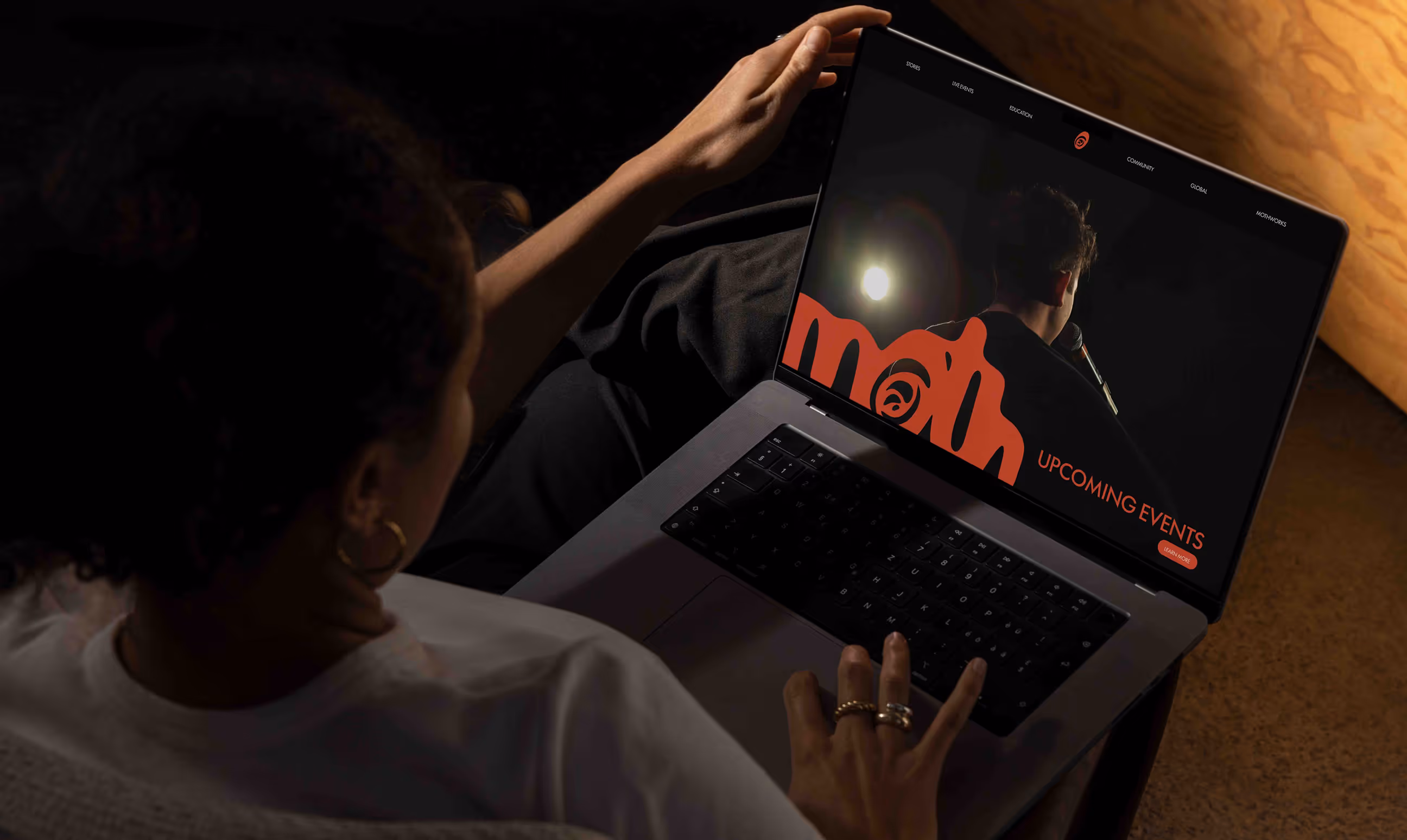
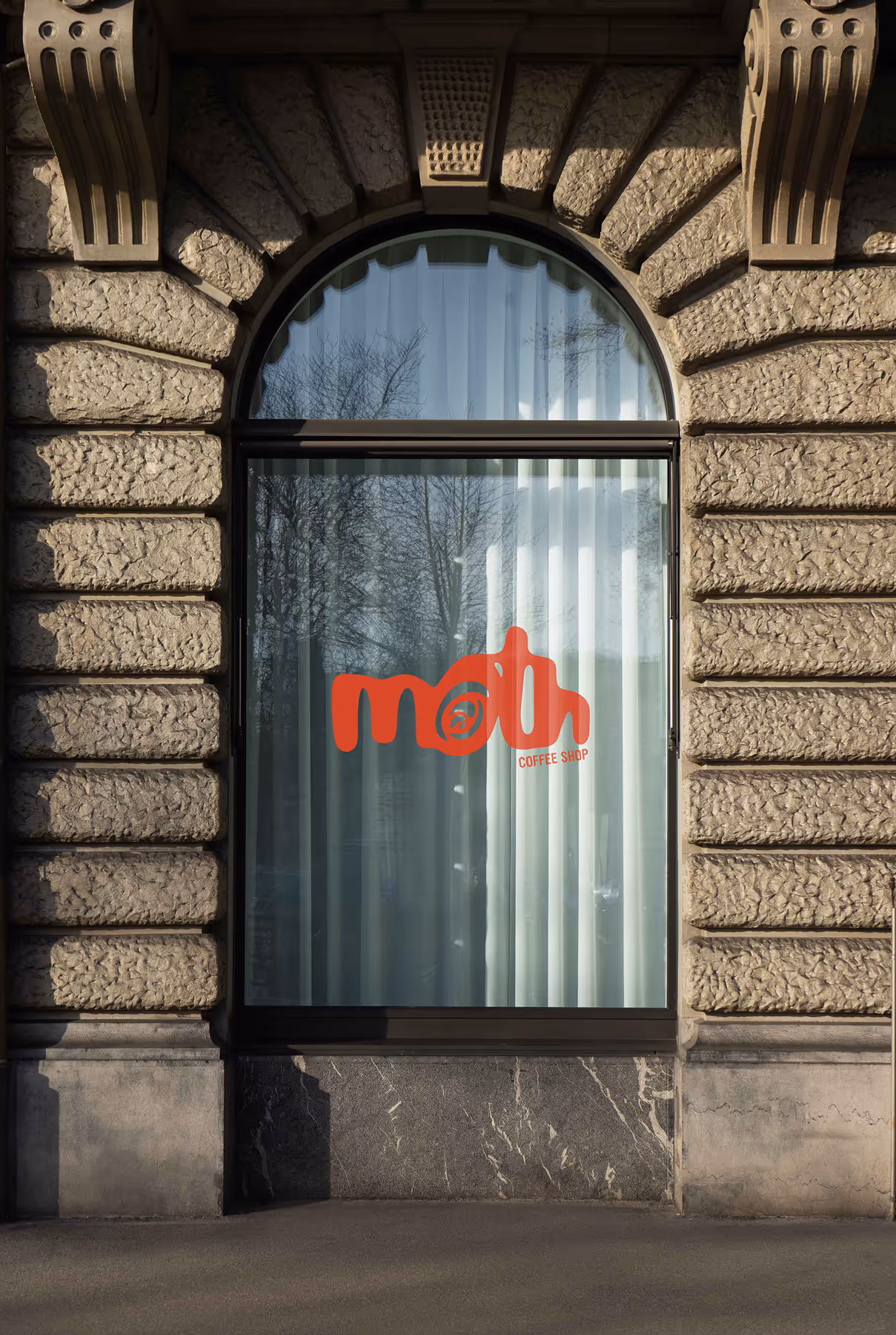
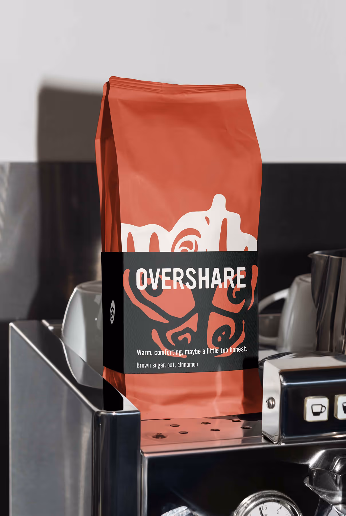
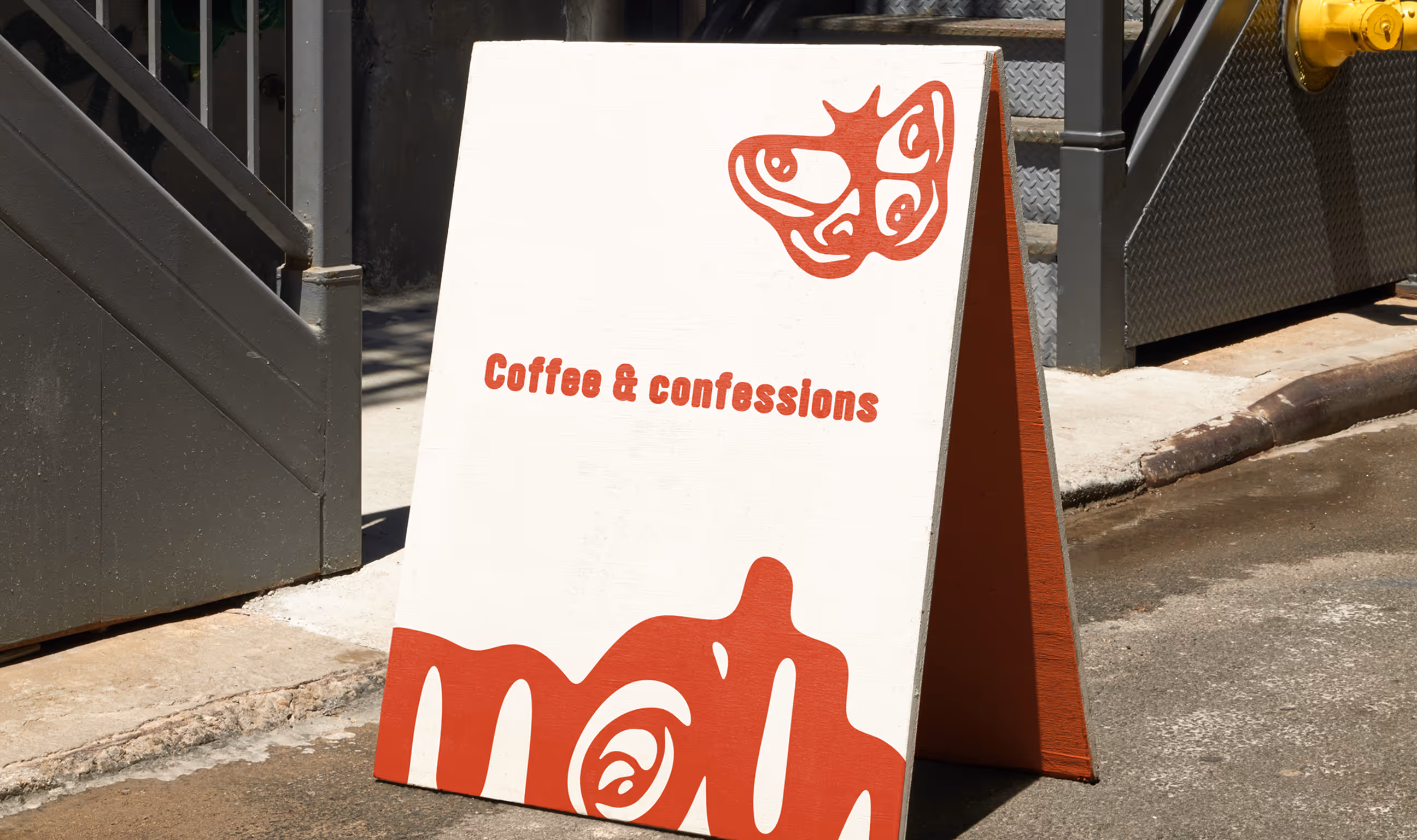
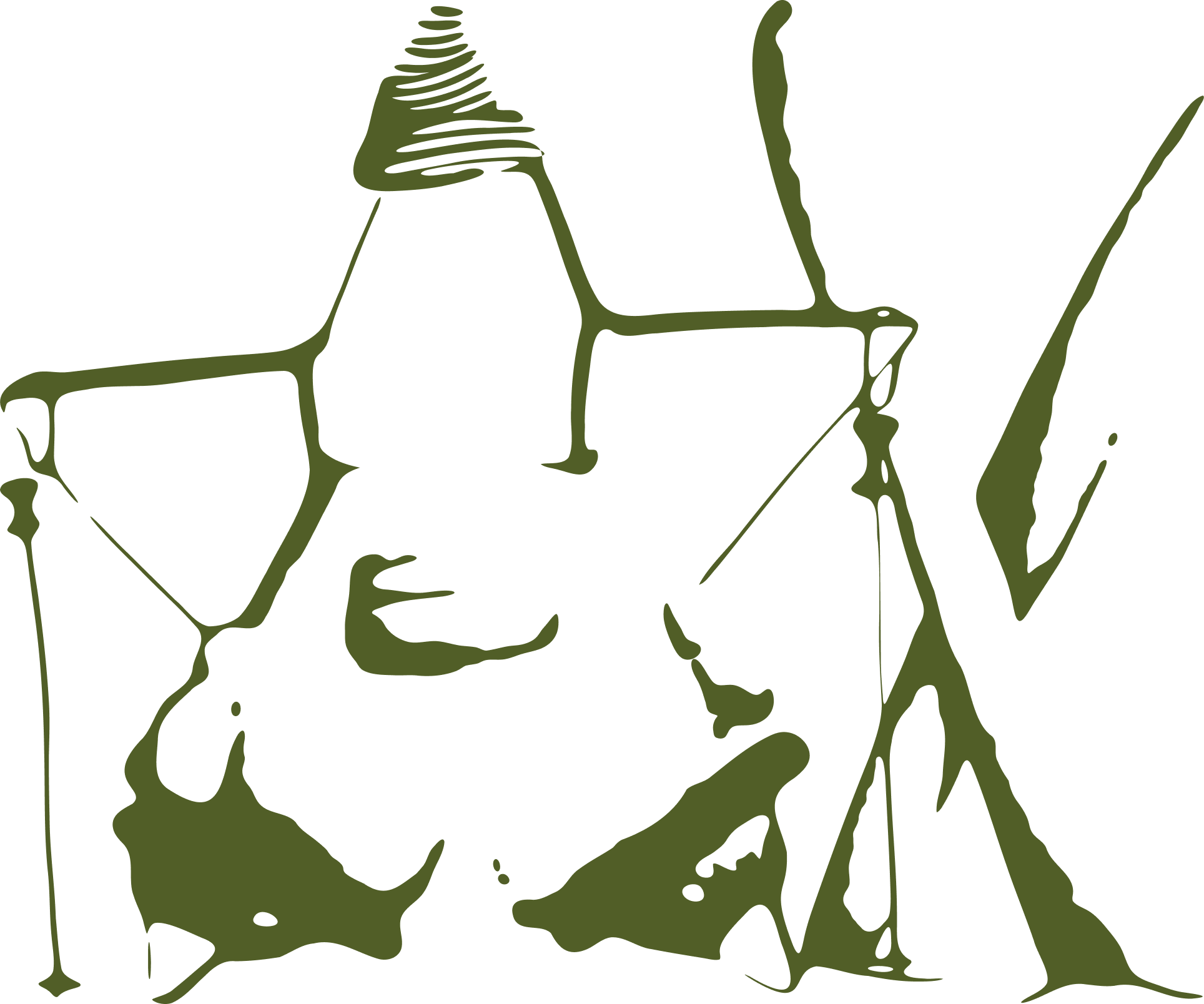
The rebrand created a more cohesive identity system built around connection, honesty, and shared experience. The logo was redesigned as a melting, connected wordmark to represent how stories bring people together, while the brand voice became more conversational, quirky, and approachable to better connect with a younger audience.The identity was expanded across books, magazines, games, merchandise, and a conceptual coffee shop experience, creating a unified system where each extension supports storytelling in a different way. Together, these elements transform The Moth from simply a live storytelling platform into a recognizable community people can connect with both during and beyond the shows.